We already have some pretty Spartan toolbars. We aim for fewer buttons, not less.
But maybe you want to go SUPER Spartan. Even fewer buttons!
Yeah, you can do that.
View > Show Toolbars > Customize Main Toolbar > Customize
I’m going to take a few things off the main editor and data modeler toolbars.
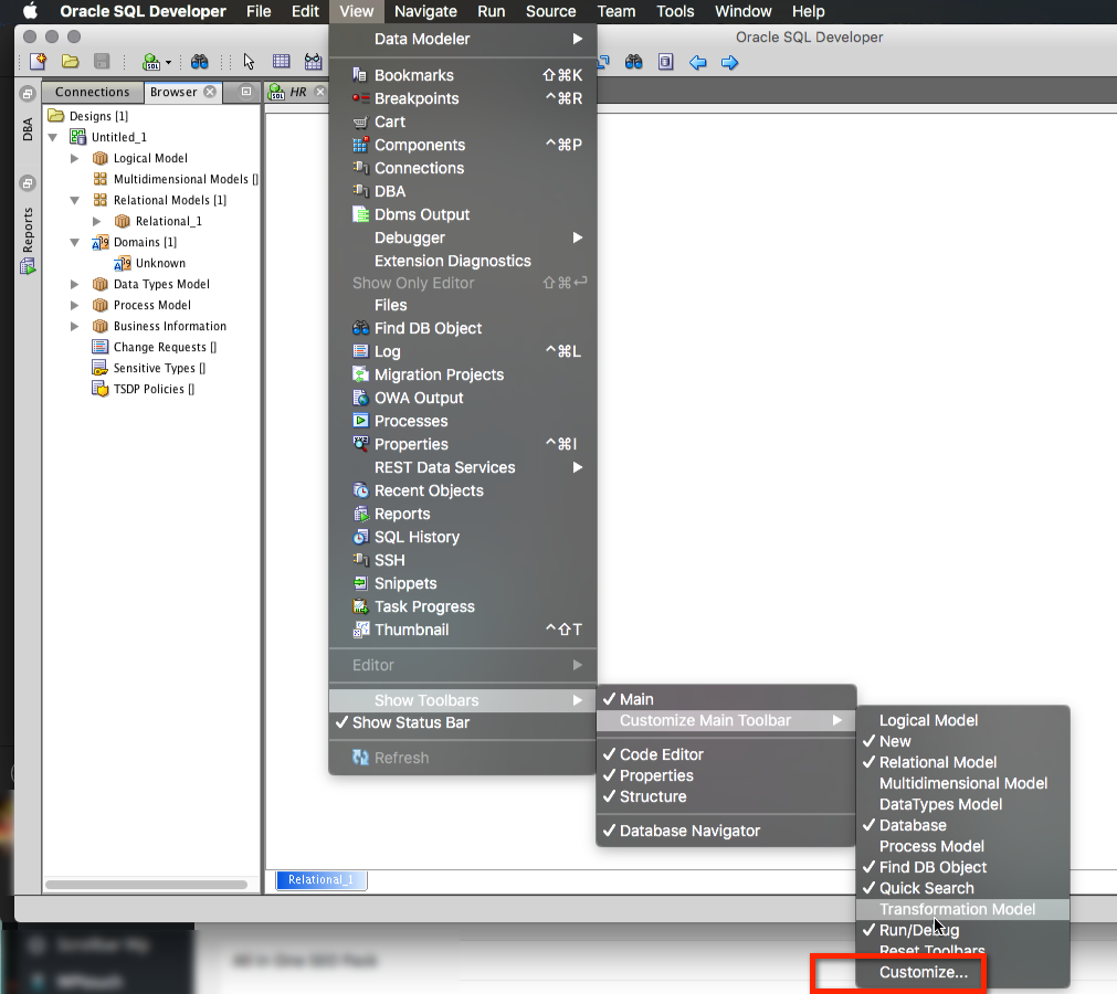
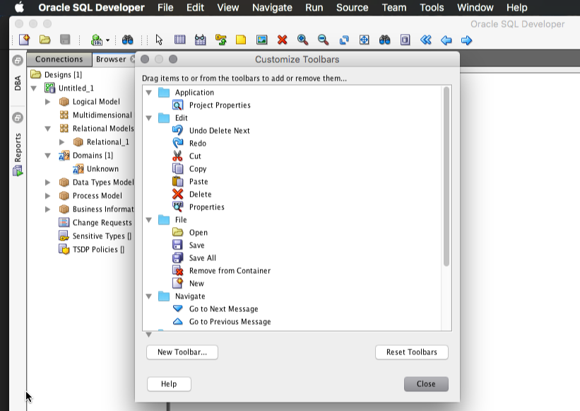
Now you’ll get a popup window. Simply grab the button you don’t want anymore, and drag it onto the popup.
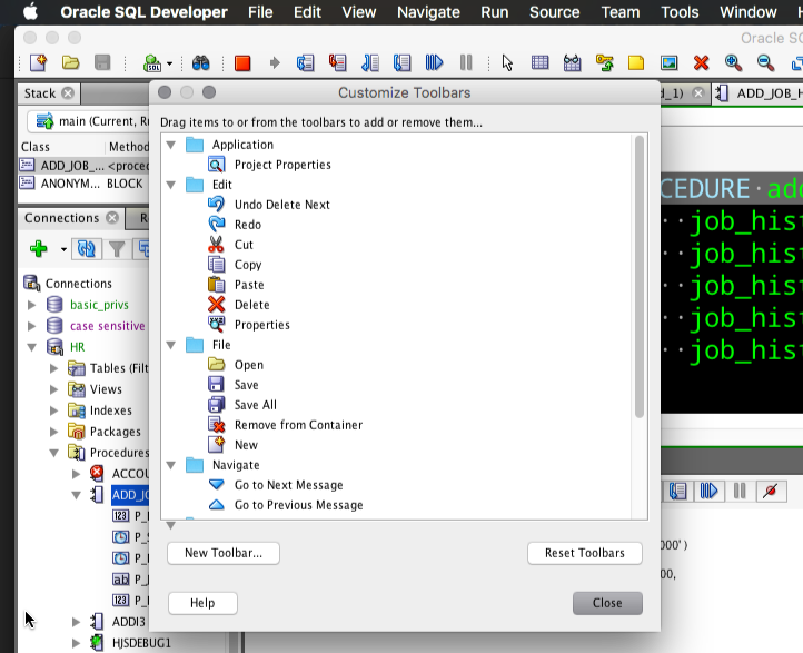
You can also customize the Debugger toolbar, just start a debug session first. Then drag buttons off the toolbar or re-order them.
If you’ve made a horrible mistake, you can always reset your toolbars.



19 Comments
Thank you so much for the “reset to factory settings” prompt, the right toolbar finally showed up for the logical model editor!
Why do you make all the toolbar icons SO SMALL. I can barely see what they are, let alone work out what they mean.
I can’t answer your question without seeing what you’re seeing. If you read any of my posts with screenshots, are my icons bigger than yours? Give me something to work with. Maybe you have a 4k monitor and the OS scaling is screwing up the resolution of SQLDev?
I wish to add DBMS_OUTPUT to the main tool bar and I’m unable. I tried following your instructions and I’m unable. Not sure what I’m doing wrong.
Is there a way to add a format sql to a tool bar?
Thanks
Hi Jeff,
and if I cant find my toolbar?
I use 4.2 version, I try to uncheck all items in View > Show toolbars, close and reopen and I cant find the toolbar. Customize is disabled…
How can I resolve this problem?
Go back to View Menu, select Show toolbars, activate ‘Main’ again.
Sorry Jeff,
I forgot to write that I already re-checked all… I have “Main” checked
Try Window > Reset Windows to Factory Settings
Perfet!!!
Thank you Jeff
No worries, I hope all goes well for you going forward 🙂
You are a effective evangelist. Many thanks for your efforts. Many times people that use Toad are eager to show me why Toad is better. I politely sit down next to them and watch as they demo their Toad. I then take the keyboard and calmly try and refute their claim. Sometimes, they give a better show & tell. I encourage them to sign up for ‘ThatJeffSmith’ and
suggest it’s better for the organization, no license key, Mos.
My point is Toad has a better look and feel. Why not try crowdsourcing the look and feel of SqlDeveloper.There are lots of smart people who can help. Well managed Crowds can help produce a superior product.
Thanks Jim!
Very much appreciate your outreach and helping get the word out!
What do you prefer about Toad’s look and feel? That it’s a native Windows application?
I actually hate the number of toolbars and buttons is has. It reminds me of a flight simulator. When I used to make/manage/sell it – I spent most of my time showing people how to turn all that stuff off.
Have you tried the Windows vs Oracle Look and Feel themes in SQL Developer itself?
hello mr smith, is there a way in SQL Developer to check with the user first whenever he clicks on the close button?
Thank you for a nice article, Jeff! I’m trying to follow your tips, but when I select View – Show Toolbars – Customize Main Toolbar, it does not give me another menu, but instead gives me a box that forever says “Initializing….”.
Any suggestions?
PS. The reason I am trying this is because somehow my additional toolbars, though “checked” to display, are not visible anywhere on the screen and I’m trying to get to that menu so that I can “reset toolbars”.
I have the same problem. The box just says “Initializing …” and is grey. I want to ADD the two macro control buttons to the menu.
I found a way to fix it. Customize just said “Initializing”. I had Version 4.1.1.19. I went to Help-> Check for Updates and updated Oracle SQL Developer AND added Oracle Extensions and Third Party SQL Developer Extensions. (I don’t know whether adding the extensions was necessary, but I figured they might need to modify the toolbar, so they might fix whatever was broken.) Anyway, it worked.
My ability to customize my menu came back, including my ability to reset my toolbar. (I was NOT been able to add the macro controls, but I have since set shortcut keys, so at least I have that.)
A comment on the statement “We aim for fewer buttons, not less.”
OK, I can agree that fewer buttons keep a GUI uncluttered and tidy (I assume that is the motivation for fewer buttons). However, if I for instance right click in an SQL Worksheet, a context sensitive menu with no less than 27 menu items (if I counted correctly) pops up. This is cluttered to me. I rather prefer a few more buttons on a toolbar over such a long list.
So maybe the above statement could be appended with: “We aim for shorter context sensitive menus, too.”?
I guess we don’t aim for shorter context menus 🙂
You only see them when you want them, and we keep adding features for folks. Thankfully most of these are also available via the keyboard.