I sometimes get a double-take when I do a blog post or tweet or show a picture of SQL Developer running on my Mac. My Macbook is my personal machine: I don’t normally do live-demo’s on it, but I almost always do my blog posts and screenshots from there.
For official webcast stuff and conferences, it’s the old workhorse Win7 machine. And it looks like this for the most part:
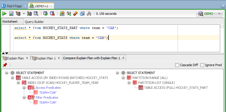
But you as a user, have a lot of control and say exactly how SQL Developer looks. After I put in my own personal preferences, I think it looks cool. Here’s a few settings to investigate and tweek.
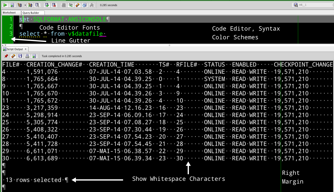
The ‘Show Whitespace Characters’ – that might not be for most folks. But I like to know when I’m seeing something weird, that it’s because there’s a linefeed or something else going on, so it’s helpful to me.
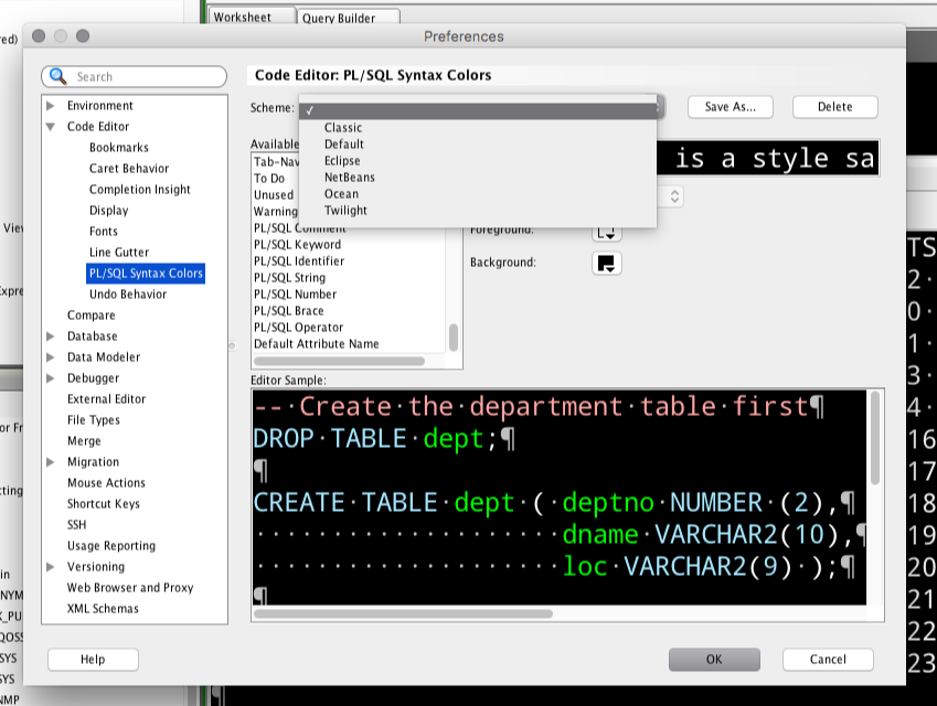
Now, you can go CRAZY with the Syntax Coloring. But, start with the themes. Find a theme that get ‘close’, and then tweak individual elements if you want.
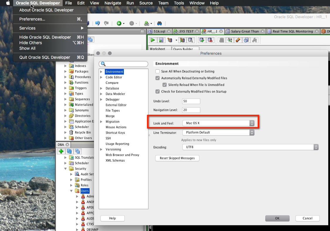
I’ve also settled, finally, on using the native OS X ‘Look and Feel’ over the Oracle LaF. That’s controlled here:
For what it’s worth, I HATE the Windows LAF, but maybe it’s better in Win 8 or 10?


